
Voting With Your Feet: What Migration Patterns Reveal About Local Government Quality
Date Published
Every year, millions of Americans hire a moving truck and cast the most expensive vote of their lives. They don't mark a ballot; they change their address. Pundits usually explain these moves with jobs and weather, but there is a quieter force at work, one that shows up clearly in government finance data. People are shopping. Specifically, they are shopping among competing local governments, comparing the bundle of taxes they will pay against the bundle of services they will receive, and choosing the jurisdiction that offers the best deal.
This idea has a name: Tiebout sorting, after the economist Charles Tiebout, who argued in 1956 that mobile residents discipline governments the way mobile customers discipline businesses. A restaurant that charges steakhouse prices for diner food loses customers. A government that charges steakhouse taxes for diner services loses residents. The moving van is the market's grade.
At StatisNostics, we built the Spending Pressure score to make that tax-and-service bundle visible at the city level. The score rolls every spending unit of government linked to a location (state, county, municipality, school district, fire district) into a single, blood-pressure-style reading of the fiscal load on a taxpayer, on a scale of 0 to 100. Higher is worse. When you lay migration data next to those readings, a pattern emerges that is hard to explain away: people flow, persistently and predictably, away from high-pressure cities and toward low-pressure ones.
The Gauge: Six Cities, One Yardstick
Consider six sample cities and their current Spending Pressure scores from the StatisNostics platform. New York City tops the chart at 97, the heaviest fiscal load in the group. Chicago reads 85. Austin comes in at 70 and Indianapolis at 69. Phoenix sits at 54, and Sarasota, Florida carries the lightest load at 49.
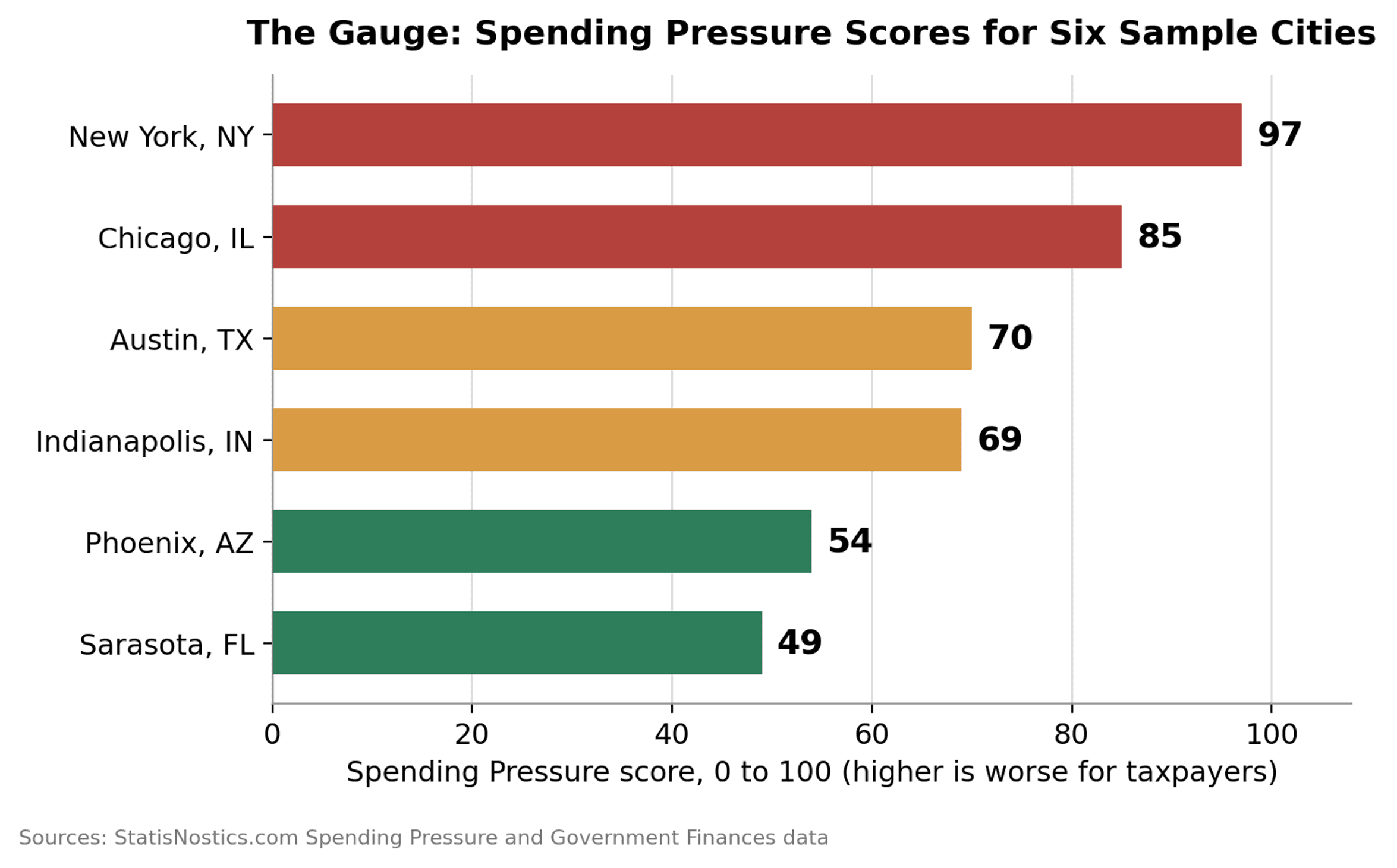
Notice what the ranking already suggests before we look at a single migration table. The two cities famous for decades of domestic outmigration, New York and Chicago, sit at the top of the pressure scale. The Sun Belt destinations that have absorbed those movers, Phoenix, Sarasota, and the Texas metros, sit at the middle and bottom. That is not a coincidence. It is the market signal.
Pressure vs. People
Plot each city's Spending Pressure score against the population trajectory of its home state in the StatisNostics government finance data (2012 to 2023) and the relationship jumps off the page. Illinois, home of 85-point Chicago, lost 1.6% of its population, roughly 202,000 people, a city the size of Rockford walking out the door. New York State, anchored by 97-point New York City, eked out just 1.2% growth over eleven years, and Census Bureau estimates show New York City posting the largest numeric population decline of any American city between 2024 and 2025. Meanwhile the low-pressure column boomed: Arizona grew 11.0%, Florida grew 12.5%, Texas grew 13.2%, and Indiana grew 4.1%.
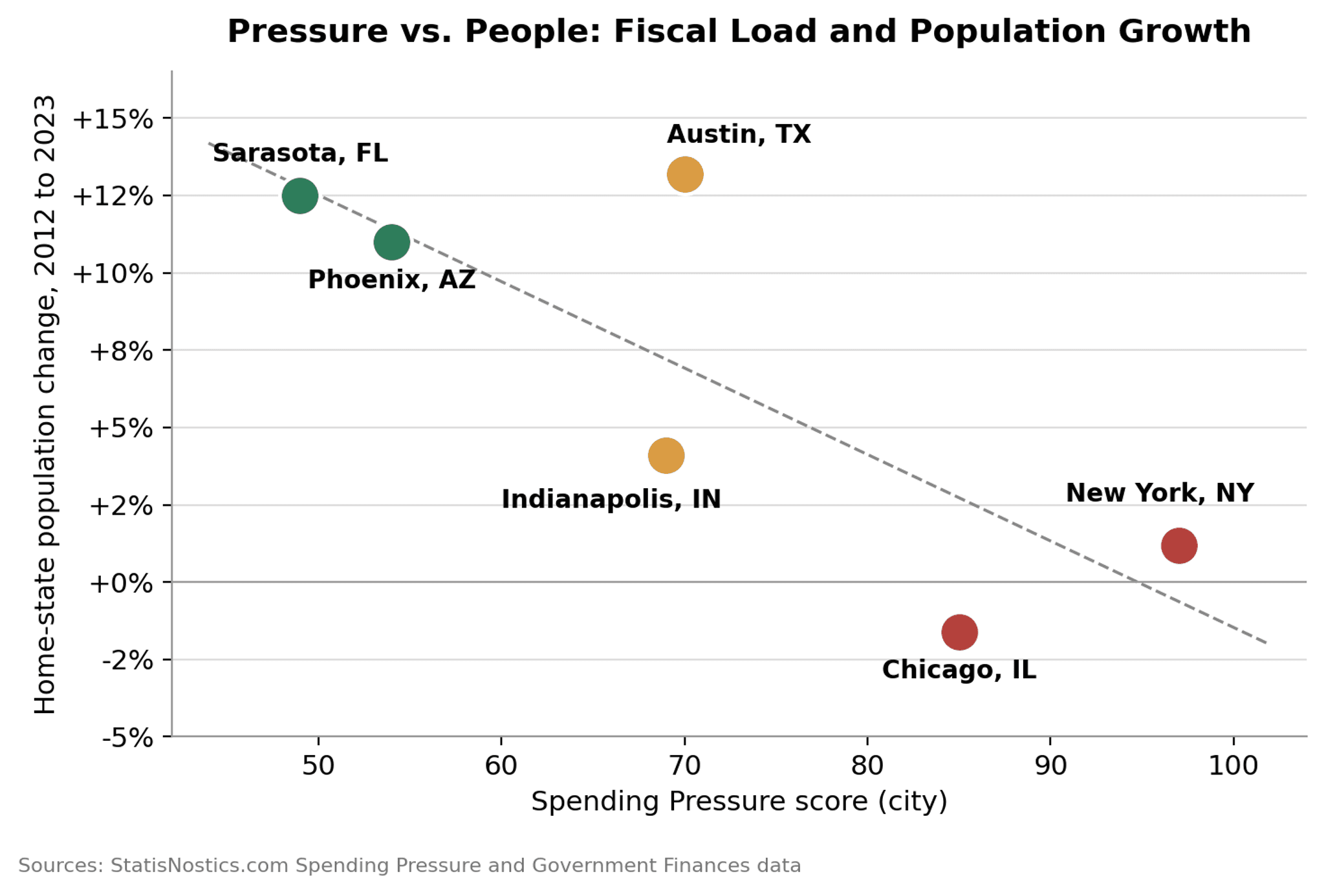
Austin is the interesting middle case. At 70, its Spending Pressure is climbing into the caution zone even as the city crossed the one million resident mark in the latest Census estimates. Tiebout theory has a prediction here too: growth is not a permanent subsidy. If Austin's fiscal load keeps rising toward Chicago territory, the same sorting mechanism that filled the city can begin to empty it. The score is a leading indicator; the moving vans are the lagging confirmation.
Head to Head: Chicago vs. Phoenix
The Chicago-to-Phoenix corridor is one of the classic migration routes in modern America, and the easy explanation is sunshine. But sunshine is a constant. Phoenix was exactly as warm in 1990, when Chicago's metro area was still comfortably gaining people, as it is today. What changed is not the weather; it is the fiscal gap between the two cities, and that gap is exactly what the Spending Pressure score measures.
The gap is wide. Chicago's Spending Pressure score is 85; Phoenix reads 54, a full 31 points lighter. Behind those city scores sit two state ledgers moving in opposite directions: Illinois lost 1.6% of its population from 2012 to 2023 while Arizona gained 11.0%, and by 2023 the average Illinois resident carried $3,353 in state long-term debt against just $893 for the average Arizonan, nearly a four-to-one difference.

The service side of the ledger widens the gap rather than closing it. On the StatisNostics city-level school data, where higher scores are better, Phoenix posts a school score of 33 against Chicago's 20, and it delivers that stronger result through classrooms running 14.37 students per teacher, roughly half of Chicago's 28.14. Line up the three panels and the service-to-tax ratio comes into focus: the Phoenix taxpayer carries 31 fewer points of Spending Pressure and receives a materially better school score in classrooms half as crowded. The Chicago taxpayer pays the second-highest fiscal load in our six-city sample and receives, for that premium, a bottom-quintile school score delivered through the most crowded classrooms in the comparison. A consumer weighing two products with these spec sheets does not need an economics degree to pick one. The migration data say hundreds of thousands already have.
The State Ledger Behind the Cities
A city's Spending Pressure does not exist in a vacuum; it stacks on top of the state government above it, and here the StatisNostics state finance data reveal something subtle. On today's sticker price, Illinois and Arizona look almost identical: Illinois state government spent $5,685 per resident in 2023 and Arizona spent $5,556, a gap of barely 2%. The difference between the two states is not what they spend this year. It is the trajectory of the balance sheet underneath, which is precisely what a single-year budget comparison misses and what the Spending Pressure score is built to capture.
Debt tells that story in slow motion. Per-capita long-term debt is the closest thing public finance has to a deferred bill, taxes promised but not yet collected. From 2012 to 2023, Illinois's long-term debt per resident rose 16%, from $2,896 to $3,353, even as the population it will be spread across shrank. Arizona went hard the other way: per-capita debt fell 47%, from $1,674 to $893, while the state absorbed 720,000 new residents. The debt management data underline the divergence. Annual debt retirement in Illinois collapsed 81% over the period, from $3.86 billion to $749 million, and in fiscal 2023 the state issued $907 million more debt than it retired, about $72 of net new obligation per resident. Arizona did the opposite: in fiscal 2023 it retired $162 million more than it issued, a net paydown of roughly $22 per resident.
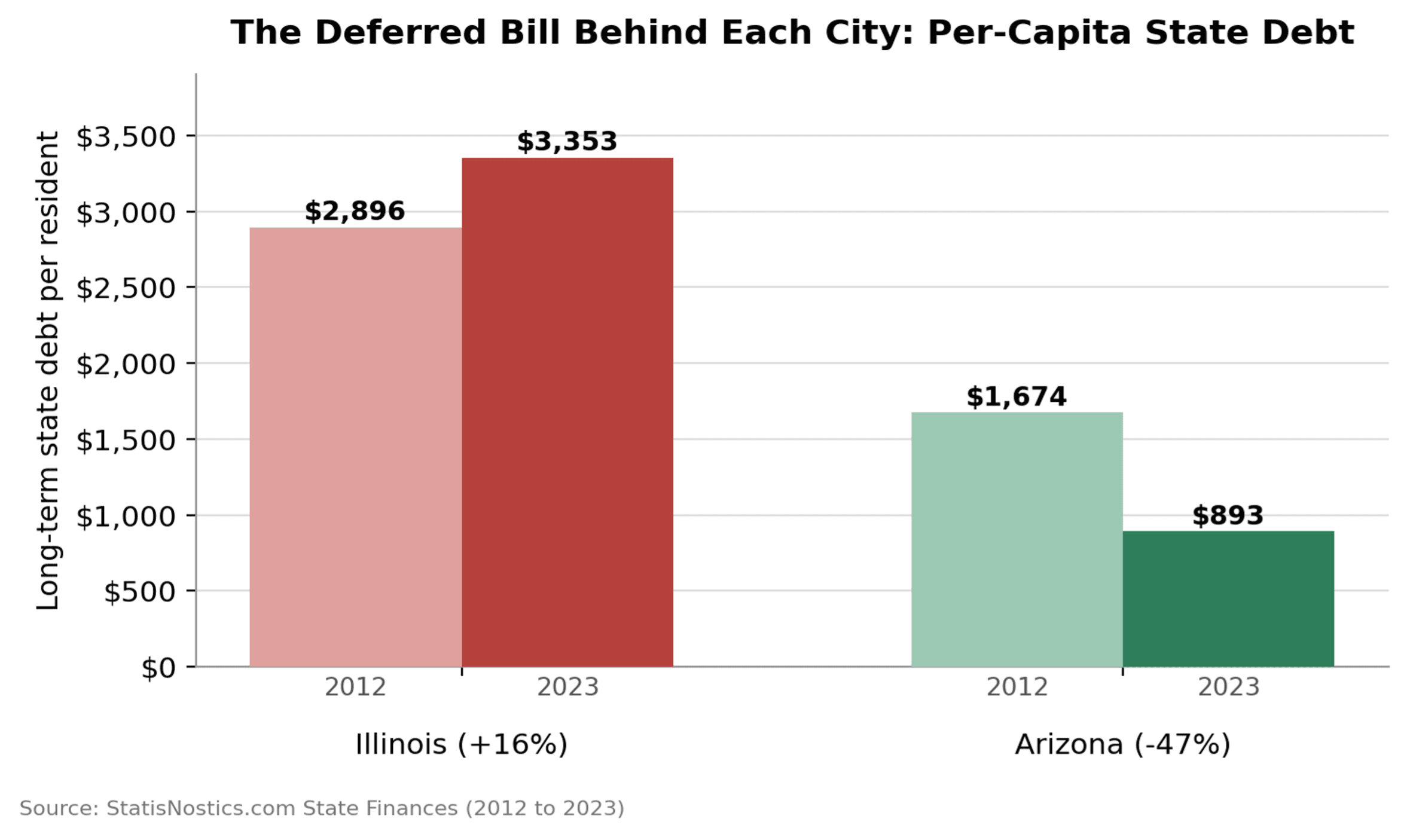
This is the migration doom loop in miniature, running forward in one state and in reverse in the other. When residents leave, the debt does not leave with them. It gets divided among fewer remaining taxpayers, which raises each one's share, which raises future Spending Pressure, which encourages more departures. When residents arrive, the same arithmetic works in the taxpayer's favor: Arizona's shrinking debt is being spread across a growing population. The pattern repeats at every altitude of the sample. New York State's per-capita debt reached $6,467 in 2023, up 30%, the heaviest in our group and the ledger beneath the country's highest-pressure city, while Florida, the state beneath our lowest-pressure city, cut per-capita debt 43% while absorbing waves of newcomers.
The Scorecard
Here is the paired comparison in one place, combining city-level Spending Pressure and school metrics with state-level finance data from StatisNostics.com:
Metric (StatisNostics.com) | Chicago, IL | Phoenix, AZ |
Spending Pressure score (city level, 0 to 100, lower is better) | 85 | 54 |
School score (city level, higher is better) | 20 | 33 |
Students per teacher (lower is better) | 28.14 | 14.37 |
State population change, 2012 to 2023 | Illinois: -1.6% | Arizona: +11.0% |
State per-capita operating spending, 2023 | $5,685 | $5,556 |
State per-capita long-term debt, 2012 to 2023 | $2,896 to $3,353 (+16%) | $1,674 to $893 (-47%) |
Net new state debt, FY2023 | About +$72 per resident | About -$22 per resident (net paydown) |
The Tiebout Conclusion: Competition Disciplines Government
Put the pieces together and the migration data stop looking like demographic trivia and start looking like what they are: a market rendering judgment. Sustained migration toward places with better service-to-tax ratios is Tiebout sorting in action. Movers are consumers; cities are competing vendors; the tax-and-service bundle is the product; and the population count is the sales figure.
The implications cut in both directions. For residents, the lesson is that your address is a purchase, arguably the largest recurring purchase your household makes, and it deserves the same comparison shopping you would apply to any six-figure decision. A 31-point Spending Pressure gap between two of America's largest cities, paired with a better school score, classrooms half as crowded, and a state ledger carrying nearly four times less debt per resident, is exactly the kind of spec-sheet comparison the score exists to enable, before you buy rather than after.
For governments, the lesson is sterner. A city losing residents is losing customers, and the model's prediction is unforgiving: it must either improve efficiency, delivering more service per tax dollar, or shrink its cost structure to match its shrinking customer base. The data show what the alternative looks like: spending per capita rising against a falling population, debt per resident climbing while debt retirement collapses, each departure raising the bill for those who remain. Competition among jurisdictions disciplines government the way market competition disciplines firms: slowly, imperfectly, but relentlessly. The moving vans are the market's verdict, delivered one household at a time. The only real question for any local government is whether it reads the verdict before the customers are gone.
Data & Methodology
City-level Spending Pressure scores (0 to 100 scale, higher indicating heavier fiscal load), school scores (0 to 100 scale, higher indicating stronger performance), and student-to-teacher ratios are drawn from the StatisNostics.com platform, which computes the Spending Pressure score by aggregating spending, debt, revenue, tax-rate, and pension-liability indicators across every unit of government linked to a location, covering all 50 states, 3,031 counties, 25,705 townships and municipalities, and 12,546 independent school districts. State fiscal and population figures are drawn from the StatisNostics.com Government Finances database (state finance pages for Illinois, Indiana, New York, Texas, Arizona, and Florida, fiscal years 2012 to 2023), with per-capita values calculated against resident population. Recent city population milestones reference U.S. Census Bureau Vintage 2024 and Vintage 2025 population estimates.