
The Fragmentation Question: Are More Local Governments Better Than Fewer?
Author
Andre Shkalikov
Date Published
At a single front door, local government rarely arrives as one provider or one bill. A household may be inside a municipality, county, school district, township, and several special-purpose districts, each with its own budget, boundaries, and fiscal claim. That layered structure is especially relevant in Illinois. The 2022 Census of Governments counted 6,930 local governments in the state, the largest total in the nation. Of those, 3,218 were other special-purpose governments and 890 were school districts.[2]
This sounds like a textbook setting for Charles Tiebout's 1956 argument. Tiebout proposed that many jurisdictions can operate like competing providers. When each offers a different tax-service package, households can choose the community that best matches their preferences, often summarized as voting with their feet.[1]
The central test Competition works only when the price is visible. Distinct service bundles support Tiebout. Hidden overlapping costs weaken the informed-consumer assumption that makes the model work. |
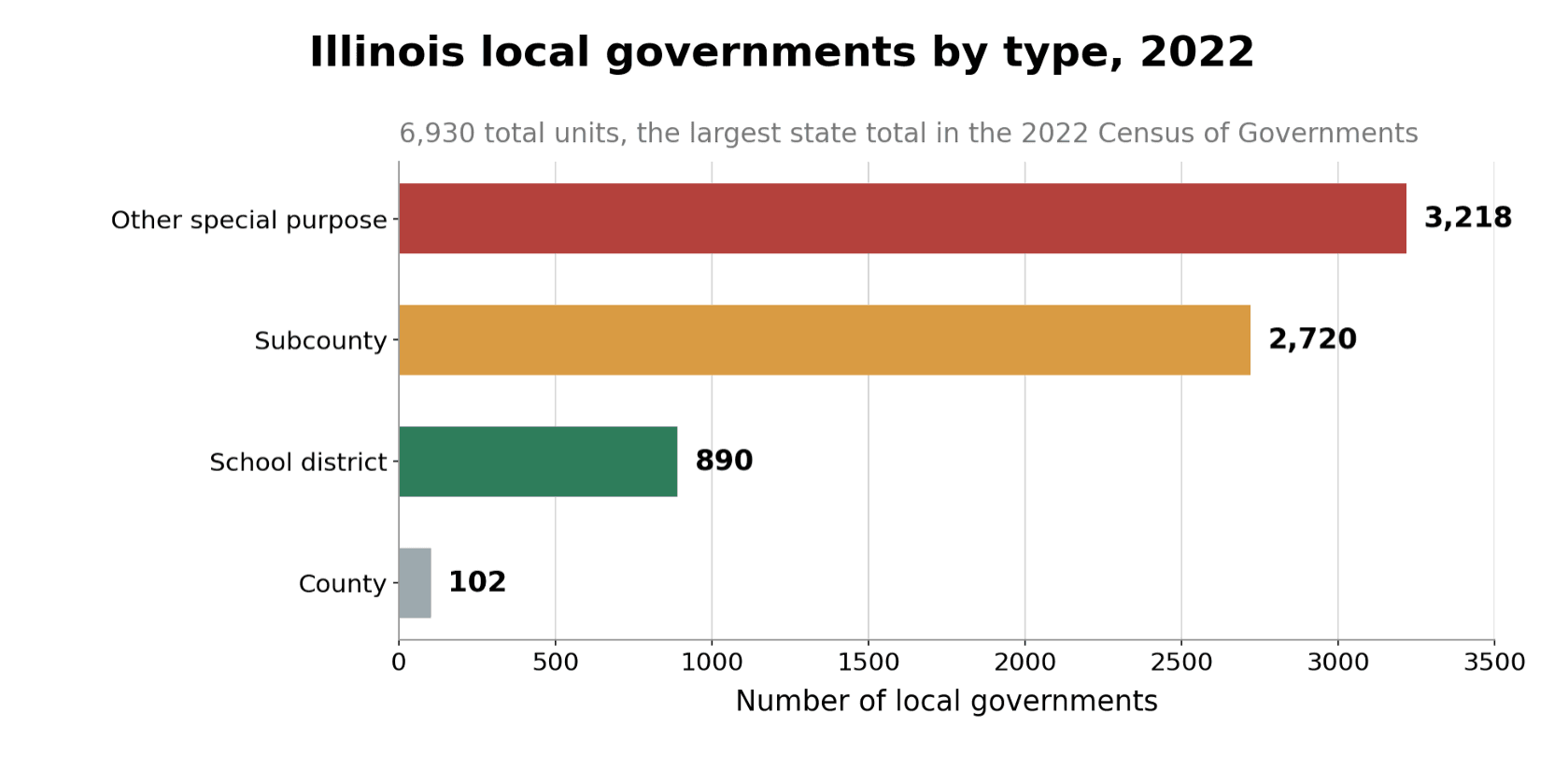
Figure 1. Illinois combines a large menu of general-purpose jurisdictions with an even larger special-purpose layer. Source: Federal Reserve Bank of St. Louis analysis of the 2022 Census of Governments [2].
The key distinction: choice versus layers
Not all fragmentation works the same way. Horizontal fragmentation creates alternatives among places. Chicago, Oak Brook, and Naperville offer different municipal, school, safety, housing, and tax environments within one metropolitan labor market. That is the kind of choice Tiebout had in mind.
Vertical fragmentation stacks multiple public bodies on a single address. Specialization can be useful, but every added layer also makes the total price harder to observe. The first form can improve preference matching. The second can create fiscal illusion, duplication, and unclear accountability.
Structure | Potential gain | Core risk |
Horizontal: many jurisdictions to choose among | Finer tax-service matching and competitive pressure | Housing access, spillovers, and unequal mobility |
Vertical: many entities serving one address | Specialized service delivery and tailored boundaries | Hidden total price, duplication, and blame shifting |
A three-community test inside one metro
These three communities are not a random sample, and they do not settle the causal question of fragmented versus consolidated government. They do provide a useful test of Tiebout's first prediction: a fragmented metropolitan area should display clearly different bundles.
Metric | Direction | Chicago | Oak Brook | Naperville |
School Ranking | Higher | 20 | 89 | 74 |
Spending Pressure® | Lower | 85 | 43 | 46 |
Crime Score | Lower | 89 | 14 | 26 |
Students per teacher | Lower | 28.14 | 10.09 | 14.94 |
Median owner-occupied home value | Context | $334,100 | $903,200 | $540,200 |
City spending per capita, FY2024 | Context | $6,998 | $7,688 | $3,634 |
Table 1. Scores and student/teacher ratios were supplied by StatisNostics [3]. Home values are the latest comparable Census estimates for all three places, covering 2020-2024 [5-7]. FY2024 city spending figures were supplied from the Illinois Comptroller database [4]. The student/teacher ratio is not the same as literal classroom size.
The profiles are not minor variations. Chicago combines a School Ranking of 20 with Spending Pressure 85 and Crime Score 89, where lower is better for the latter two. Oak Brook combines 89, 43, and 14. Naperville sits between them on school and crime outcomes, while remaining close to Oak Brook on Spending Pressure.
Staffing ratios reinforce the separation. Chicago's 28.14 students per teacher is nearly 2.8 times Oak Brook's 10.09 and almost twice Naperville's 14.94. In Tiebout terms, the market is offering different products, not one standardized local government package.
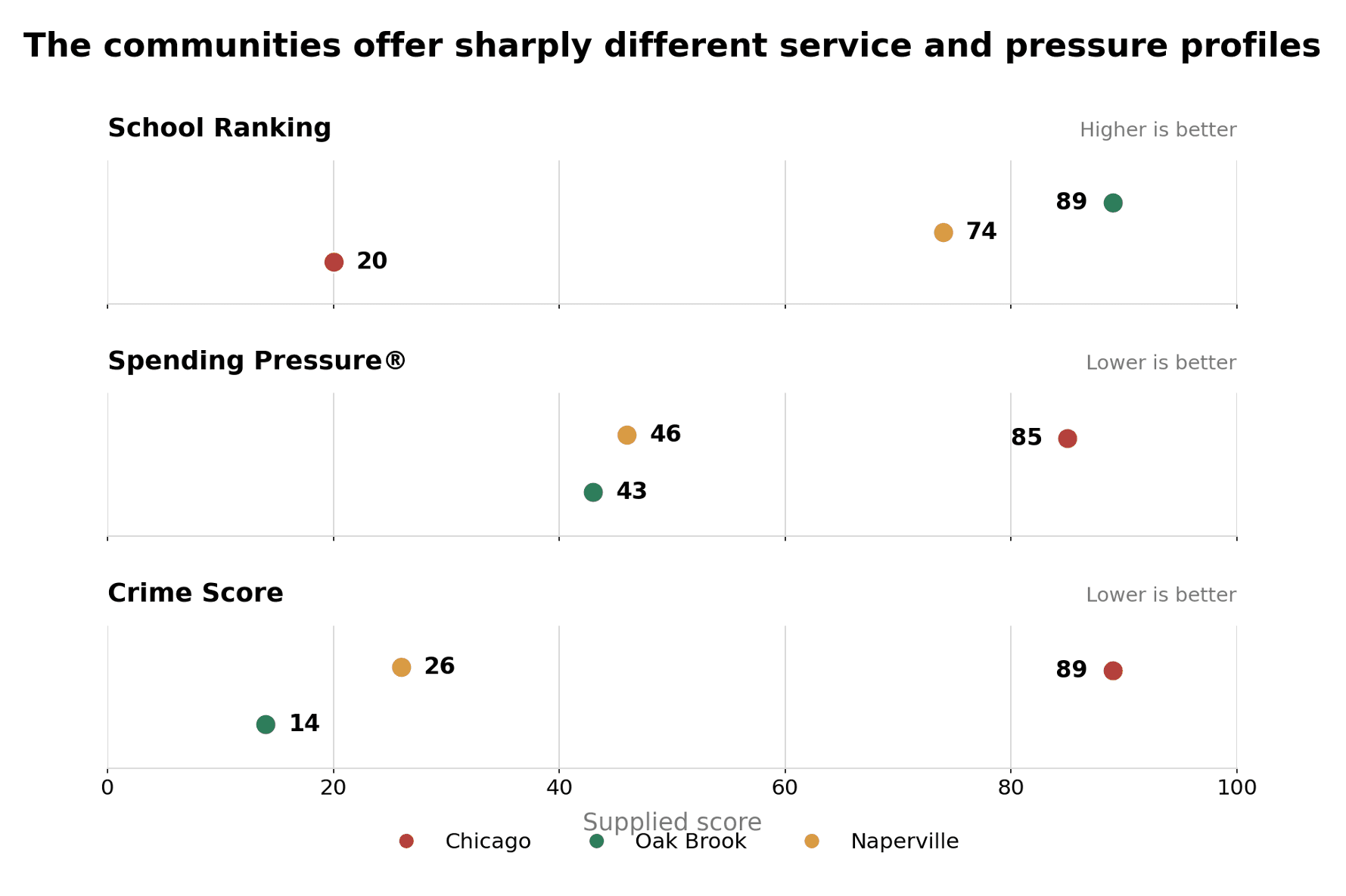
Figure 2. Fragmentation produces visible differentiation across the three supplied scores. Source: StatisNostics data supplied for this article [3].
The denominator trap
City spending per capita does not follow a simple outcome gradient. Oak Brook spends $7,688 per resident, Chicago $6,998, and Naperville $3,634. Naperville's municipal figure is about 53 percent below Oak Brook's, yet its school and crime scores are much closer to Oak Brook than to Chicago. Taken alone, that looks like a striking efficiency result.
Taken alone is the problem. School outcomes are produced mainly by school systems, not city hall. Crime conditions can involve municipal police, county courts, prosecutors, transit agencies, state policy, and broader social conditions. A city-only spending number is therefore not the full fiscal price of the outcomes shown here. The Illinois Comptroller also notes that local financial data are self-reported by local governments.[4]
Using the incomplete denominator, School Ranking points per $1,000 of city spending are 2.9 in Chicago, 11.6 in Oak Brook, and 20.4 in Naperville. An inverse Crime Score, calculated as 100 minus the supplied score, yields 1.6, 11.2, and 20.4 points per $1,000. Those eye-catching ratios are not valid estimates of total efficiency. They demonstrate how strongly the answer can move when the denominator leaves out overlapping entities.
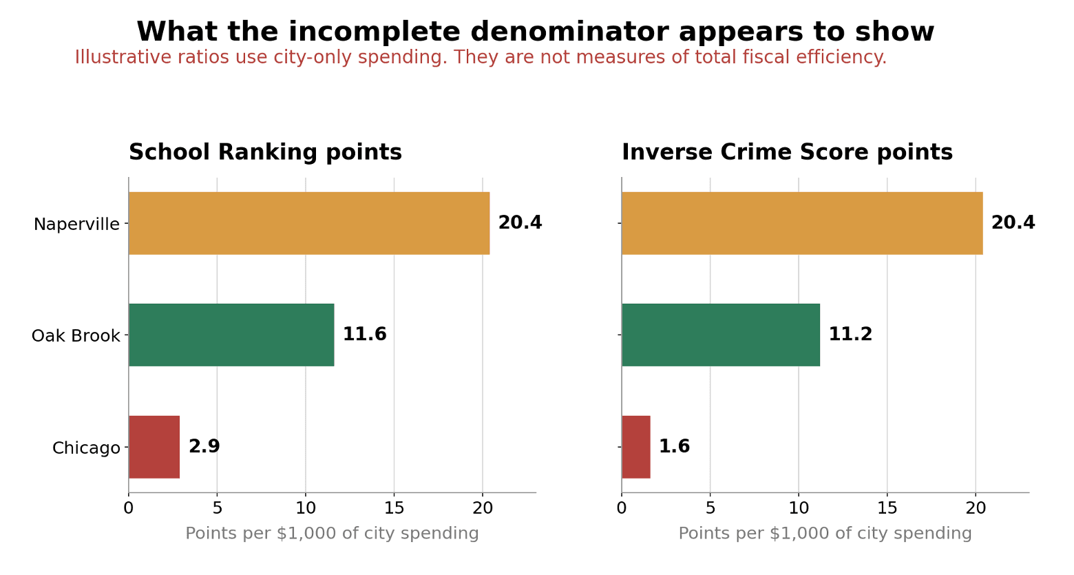
Figure 3. The city-only denominator makes Naperville look dramatically more efficient. That may be real, or it may reflect service mix, tax base, costs carried by separate entities, or all three. Source: StatisNostics scores [3] and FY2024 city spending figures supplied from the Illinois Comptroller database [4].
Why this matters for Tiebout A market needs a comparable price. Municipal spending is not the all-in price when school districts, counties, townships, and special-purpose bodies also serve the address. Without the full ledger, residents cannot reliably compare bundles. |
Housing values suggest sorting, but also a gate
The latest comparable Census estimates put median owner-occupied home value at $334,100 in Chicago, $540,200 in Naperville, and $903,200 in Oak Brook.[5,6,7]
The ordering is consistent with capitalization, one channel through which attractive public-service access can become embedded in land and housing prices. In this three-place sample, stronger school and crime scores travel with higher housing values. Oak Brook's median is about 2.7 times Chicago's, while Naperville's is about 1.6 times Chicago's.
That pattern is evidence consistent with sorting, not proof that government quality caused the values. Location, housing stock, lot size, jobs, private amenities, zoning, and household income also matter. It is also an equity warning. A community choice associated with a $903,200 median home is not equally available to every household. Tiebout can improve matching for people who can move and pay, while still sorting access by wealth.
Diversity complicates the simple sorting story
The communities also differ demographically. CMAP's 2020-2024 American Community Survey estimates show Chicago at 32.1 percent White non-Hispanic, 29.7 percent Hispanic or Latino, 27.4 percent Black non-Hispanic, 7.2 percent Asian non-Hispanic, and 3.5 percent other or multiple races. Oak Brook and Naperville both have White majorities and substantial Asian populations, but their mixes are distinct.[8,9,10]
Using those five mutually exclusive categories, the diversity index is 0.727 for Chicago, 0.568 for Naperville, and 0.538 for Oak Brook. Higher values indicate a more even distribution across categories. Chicago is the most evenly mixed of the three, but none is one-dimensional.
Demographic differentiation can accompany sorting, but it should not be treated as preference matching itself. Residents with the same racial or ethnic identity can want very different tax-service bundles, and households with similar service preferences can have different identities. Demographics belong in the controls of a fragmentation study, not in its verdict.
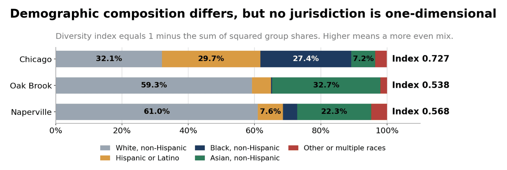
Figure 4. Different jurisdictions attract different demographic mixes, but demographic sorting is not a direct measure of fiscal preference matching. Source: CMAP Community Data Snapshots using 2020-2024 ACS five-year estimates [8-10].
What would prove that fragmentation works?
A decisive fragmented-versus-consolidated test needs address-level fiscal accounting. A consolidated government may make the ledger easier to see and reduce duplicated administration, but it can also flatten the menu of choices and weaken competitive pressure. Neither architecture wins automatically.
A defensible metro comparison | |
1 | Map every independent spending and taxing entity that serves each address. |
2 | Calculate an all-in fiscal footprint, aligning fiscal years and netting intergovernmental transfers to avoid double counting. |
3 | Measure school, safety, infrastructure, and other outcomes with comparable definitions and service populations. |
4 | Compare matched fragmented and consolidated metros while controlling for income, demographics, density, housing, service mix, and spillovers. |
The empirical questions are then straightforward. Do fragmented metros offer a wider menu of genuinely distinct bundles? At the same all-in price, do they produce better outcomes? If the answer to both is yes, Tiebout's efficiency claim gains support. If apparent gains disappear after hidden layers are included, fragmentation may be duplication, cost shifting, or both.
If bundles differ but households cannot see the total price, competition is present in form but not in function. That is the core reason address-level fiscal transparency matters.
The verdict: conditional competition
The Chicago-area evidence produces a conditional verdict. Fragmentation clearly creates different bundles, which is the first thing Tiebout requires. Chicago, Oak Brook, and Naperville are not interchangeable products. Their school scores, crime scores, pressure scores, staffing ratios, spending figures, housing values, and demographic profiles are sharply different.
The same evidence also shows why a city-only spending number is insufficient. It can make efficiency look obvious precisely where the total price is least visible. More local governments can be better than fewer when they create meaningful choice, expose the full cost, and remain accountable for results. Without that transparency, residents are comparison shopping with part of the price tag covered.
Address-level fiscal transparency is therefore not merely a reporting convenience. It is the market infrastructure that makes local government competition possible.
Sources and methodology
Method note. All calculations in the article are descriptive. The output-per-dollar ratios intentionally use the incomplete municipal-spending denominator to illustrate the transparency problem; they should not be interpreted as causal or comprehensive efficiency estimates. The diversity index equals 1 minus the sum of squared shares across the five CMAP race and ethnicity categories.
1. Tiebout, Charles M. “A Pure Theory of Local Expenditures.” Journal of Political Economy 64(5), 1956, 416-424. Publisher page and DOI.
2. Smaldone, Andrew. “The Number and Types of Local Governments in the U.S.” Federal Reserve Bank of St. Louis, March 14, 2024. Based on the 2022 Census of Governments. Source.
3. StatisNostics. Community metrics supplied for this article: School Ranking, Spending Pressure®, Crime Score, and student/teacher ratio. July 2026.
4. Illinois Office of Comptroller. “Financial Databases.” FY2024 city spending per capita figures were supplied in the article brief and attributed to this database. The database states that local government financial data are self-reported. Source.
5. U.S. Census Bureau QuickFacts. Chicago city, Illinois. Median value of owner-occupied housing units, 2020-2024: $334,100. Source.
6. U.S. Census Bureau QuickFacts. Oak Brook village, Illinois. Median value of owner-occupied housing units, 2020-2024: $903,200. Source.
7. U.S. Census Bureau QuickFacts. Naperville city, Illinois. Median value of owner-occupied housing units, 2020-2024: $540,200. Source.
8. Chicago Metropolitan Agency for Planning. Community Data Snapshot: Chicago, June 2026 release, using 2020-2024 ACS five-year estimates. PDF.
9. Chicago Metropolitan Agency for Planning. Community Data Snapshot: Oak Brook, June 2026 release, using 2020-2024 ACS five-year estimates. PDF.
10. Chicago Metropolitan Agency for Planning. Community Data Snapshot: Naperville, June 2026 release, using 2020-2024 ACS five-year estimates. PDF.